Don’t start with the logo. – You feel that your brand isn’t quite right anymore. So you think: a new corporate identity. New logo. New website. Understandable. But it’s the wrong order. Design reinforces what’s already there. It doesn’t replace what’s missing. And what’s usually missing isn’t design — it’s clarity. About why you do what you do. Why customers choose you. Only when that’s clear does design have something to say. The Brand Compass gets you there. In three steps, without detours. Discover the Brand Compass
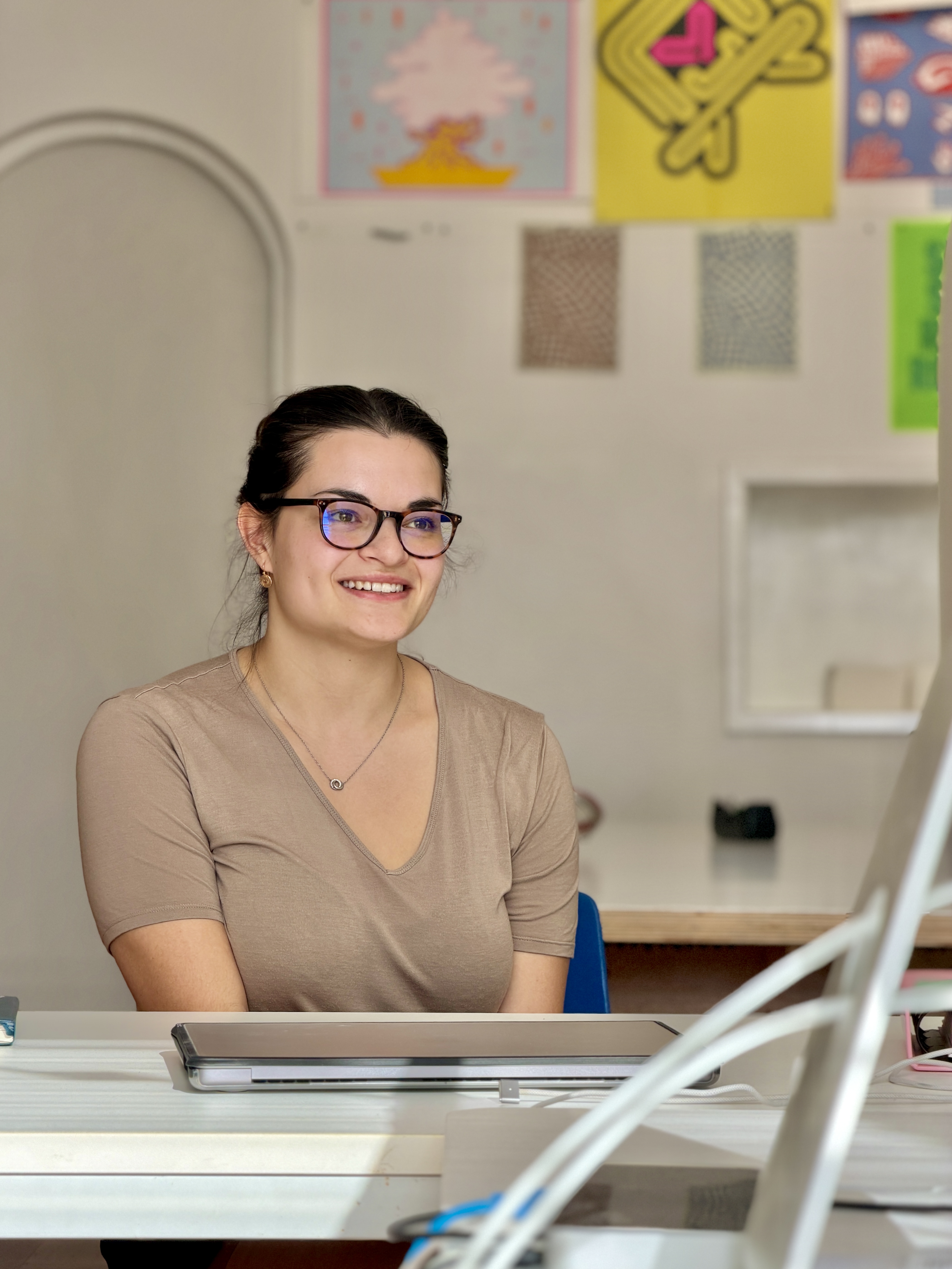
Hi, I’m Mascha — I’m studying Graphic Design at Minerva in Groningen. My creative interests range from painting and drawing to photography. For me, graphic design is where everything comes together. And now I’m doing an internship at Buro reng, where I get the chance to experience the design process up close: from initial ideas and sketches to the moment a design really takes shape. It’s an educational place where I’ll be observing until June!
Today an engine block, tomorrow an operating theatre—That is GROOW Active Spaces – a place where learning becomes an experience. Together with Patricia and Vincent, we developed an identity that perfectly reflects what characterises them: open, energetic and dynamic. View the case GROOW
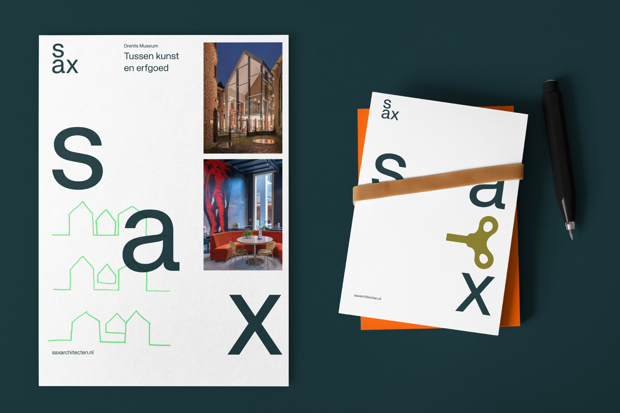
Architecture with attention — What do you need to live, work, or gather somewhere comfortably? At SAX, it starts with paying attention to your needs. A good building or interior is created by listening and understanding what is going on. Also saxarchitecten.nl Also Case Sax
Let’s Go 2026! – We look back on a year filled with new faces and new projects, with our trusted approach as a solid foundation. Each time it started with the same question. What do you really want to say? That’s why we started with MerkKompas. Thanks to everyone who took us along on their journey, kept us sharp, and gave us the confidence to do things differently sometimes. Are you working on something that isn’t quite right yet, but is important? Let us know.
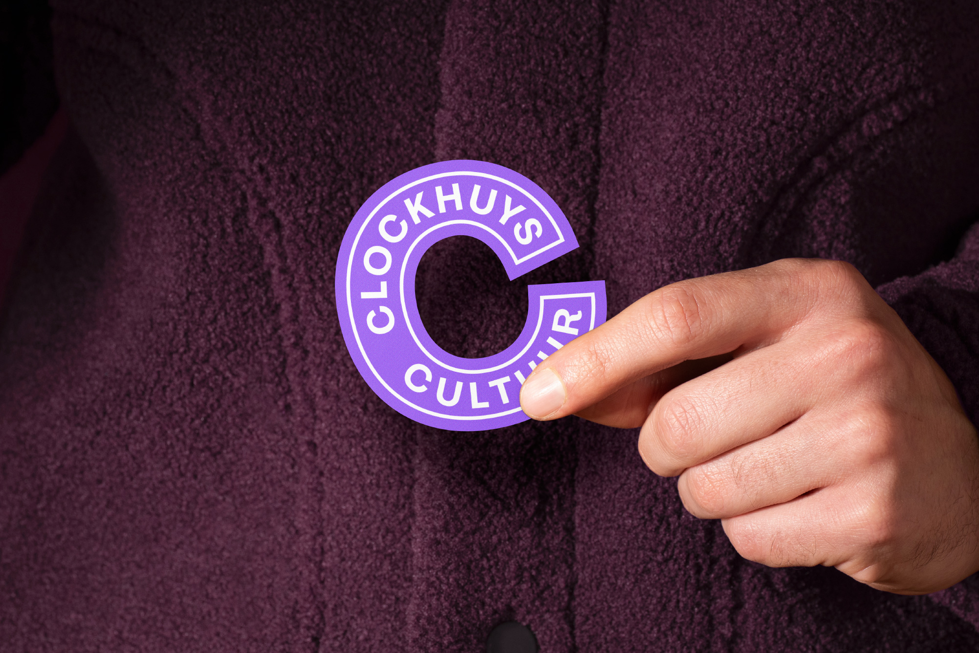
Come and discover what you want to learn! – Want to try something new, make something with your hands, or perform on stage? Clockhuys Cultuur is Haren’s creative hub. A place where you can clear your head by putting your hands to work. Here, you can experiment, make mistakes, and discover new sides of yourself. Case
What is the condition of my property? – A new name, a new look, a clear story. We are Pandmeester. The name says it all: "pand" stands for the building, "meester" for professional knowledge and insight. We bring that together. We guided the entire process: from the development of a new brand name to an identity that permeates everything in order to convey the message powerfully. A message based on trust and that is future-proof. pandmeester.nl
What if one plant could change the world?-Opus Cactus explores the potential of the Opuntia cactus, a plant that grows where little else can survive. A crop with potential, not only for agriculture and industry, but also for a more sustainable future. Want to see more?
FSG; How Buro Reng built a community driven student Association
–The FSG branding project by Buro Reng is a testament to the power of thoughtful design and strategic thinking. It’s a prime example of how a brand can be more than just a visual identity; it can be a catalyst for growth, connection, and success. This is the key to making the student association a success in the long term.
weandthecolor.com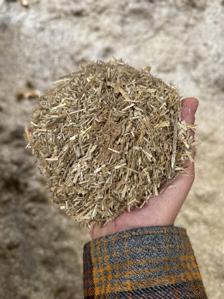
We design structures that are in place. – Architect duo Boukje Klaver and Anne Taeke Meijer form buro Appelmoes. In 2024, they received the Talent Development Scheme of the Creative Industry Promotion Fund. With their passion for local, sustainability and innovation, they create structures that are more than objects – they are connected to their surroundings, people and nature. The aim is to professionalise. Using our Brand Compass approach, we realised the brand story and strategic positioning. See also buroappelmoes.nl See also Buro Reng Brand Compass
Perspective on rural areas – Landscape Collected strives to create landscapes that move with nature and enhance existing qualities. Often a project begins by asking questions that reveal the unique dynamics of a place. By combining research and experimentation, they discover how landscapes function and develop gradually – layer by layer. See here
The hydrogen network for new energy – The energy transition requires more than plans; it requires a solid infrastructure and clear direction. Hynetwork, a subsidiary of Gasunie, is developing the network that will make hydrogen accessible for industry, transport and energy production. See also hynetwork.nl
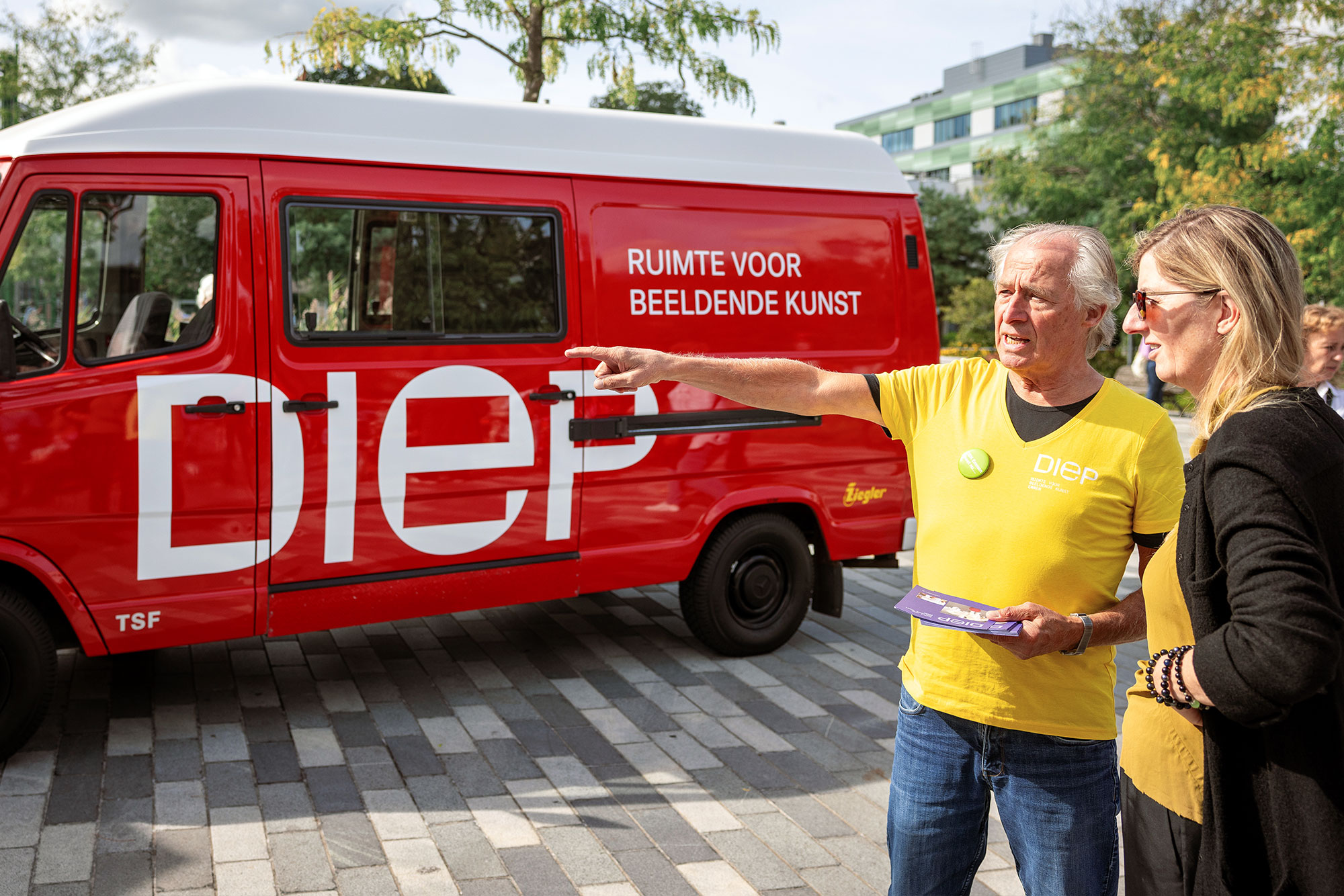
For anyone who wants to experience art. – DIEP Emmen – formerly CBK Emmen – wants to bring art closer to the public and make a connection between artists and art lovers. With our design for DIEP’s new visual identity, we want to strengthen accessibility. With bright colors, clean geometric shapes and an inviting tone, the corporate identity ensures that DIEP is recognizable and welcoming to anyone who wants to experience art. View here
Lick me crazy – Silly Dog is a webshop that caters to dog lovers. They offer a wide selection of dog snacks, toys, slow feeders and unique dog greeting cards. You can also put together personalized gift boxes for different occasions, such as dog birthdays or as a maternity gift for a puppy. Silly Dog combines fun and practical products for dogs and their owners. Visit their site for more details: Silly Dog. We developed the brand’s branding and art direction. Go Silly Dog!
Noflike krystdagen
– The annual heartwarming Christmas musical for young and old(er) from De Lawei is a household name in the North of the Netherlands. A real family performance for, by and about Drachten. This year it is already the eighteenth family performance by De Lawei! The family performance is part of De Lawei’s talent development program. In the spring there are auditions in which everyone can participate. From the auditions a cast is chosen filled with amateur talent. In September the cast starts rehearsing and in December they are finally on stage. De Lawei’s wish is to develop an identity from the right starting point that fits story, goal and target group, in order to create a style that fits and is therefore own and recognizable. Buro reng designs the identity. Zie ook lawei.nl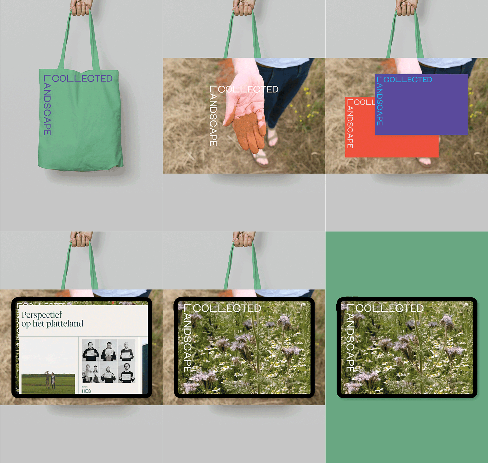
Corporate identity for ‘de landschappers’
– Landscape architects Jonas Papenborg and Lieke Jildou de Jong together form Landscape Collected. They plant hedges and follow their growth, make a detailed herbarium to better understand the natural environment, and engage in conversations with experts to gain deeper insights into the landscape. They don’t keep the findings to themselves. They share them with the world through engaging installations, inspiring exhibitions and informative publications. Join Landscape Collected and discover how together we can contribute to a healthier environment! Go to landscapecollected.nl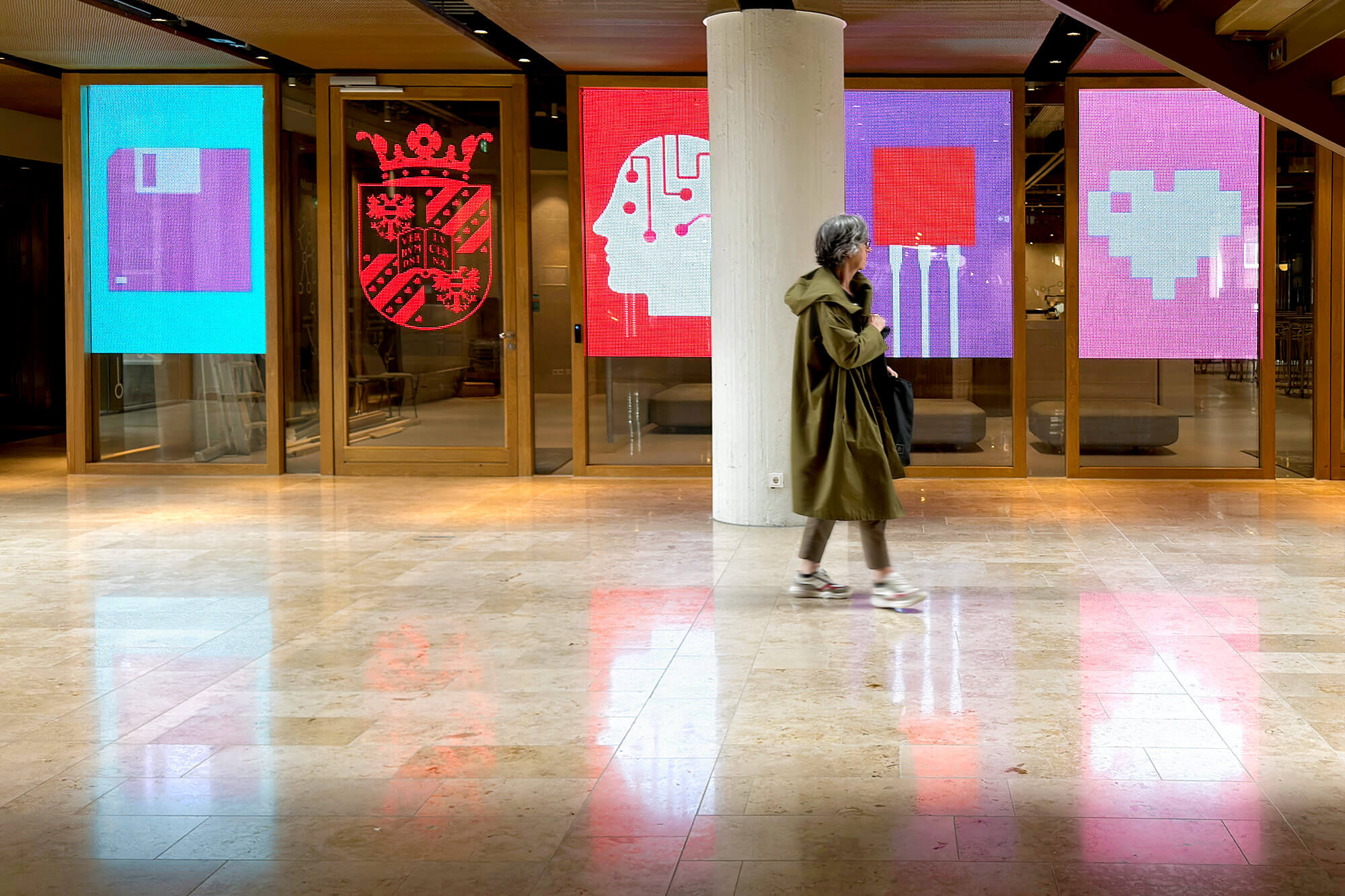
We ran across it by accident – We ran across it by accident; a test of the icons we designed for the Schools for Science and Society at the University of Groningen. In the House of Connections on the Grote Markt, the icons of Schools for Science and Society at the University of Groningen are displayed on vibrant LED screens. But this presentation is more than just a visual treat. It is a dynamic experience, where the screens and icons can adapt to the topic, the sender, the organizer or even the current events of the moment. It is an invitation for dialogue, an opportunity for the schools to engage with their partners and the general public. While in conversation with the technical expert responsible for this spectacle, the final details are discussed – small adjustments needed to make everything run perfectly. And then. then we can already see the first animations before us, ready to capture the audience’s imagination and start the dialogue. Also see House of Connections
Space for theater – We are a theater school. We offer space. Space to create and play, space to be yourself and space to grow. Our home is in Emmen, but we move throughout Drenthe.Everyone is welcome. Fun is paramount, but there is also hard work. Development requires commitment. Only by giving yourself completely, you get the space to grow. And we are happy to help you with that. Buro Reng develops the brand strategy and new visual identity for Loods dertien.
Business tour
–
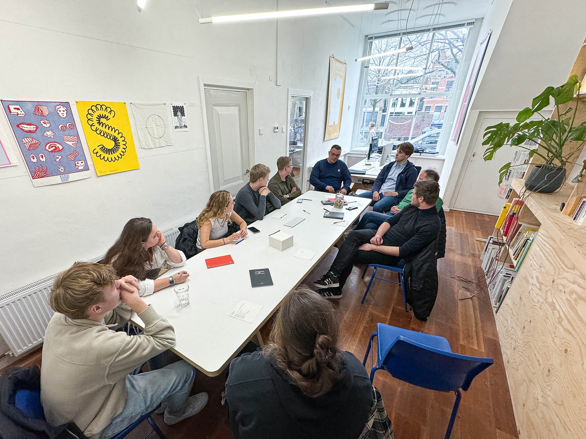
Nynke called. Whether we wanted to take part in the Hanze University of Applied Sciences’ company tour. Goal – to introduce students from the Communication & Multimedia Design course to our work. Preferably in an active way. Good idea, we’re in! We ask them how they start an assignment. Then we tell them and show them how we start an assignment. It turned into a great conversation with lots of examples and anecdotes. Oh yes, they also wanted to know how much we earn by designing a logo.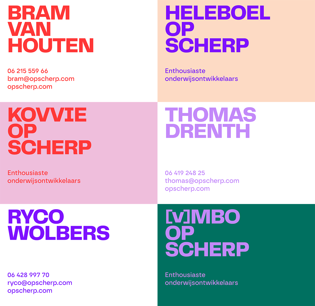
Brand on Sharp! – At a time when [V]MBO receives far too little attention and appreciation, it takes courage to stand up for it. Behold Op Scherp. Ryco, Thomas and Bram who have the VMBO at heart: ‘We are enthusiastic educational developers with head, hands and heart for the [v]MBO. Our focus is on action. Our approach is creative. No outside advice but cooperation in practice!’ To this we like to contribute! Buro Reng develops the branding for Op Scherp. Using the MerkKompas approach we develop brand strategy and visual identity. With great pleasure and enthusiasm!
Hi, I’m Niki!
–
I am currently in my fourth year of studying Graphic Design at ArtEZ Zwolle and will be doing an internship at Buro Reng for the next three months. I was looking for a place where they dive deep into research and conversation. Research there is as popular as the end result. For this I am in the right place, I am looking forward to it!
Welcome to ZEKERTRUTTEN. A place where you can be who you are. Effortlessly casual, beautiful, chill and nothing more. – ZEKERTRUTTEN is Fien, a young woman, is instagram, TikTok, website, business, sticker, bracelet, hair clip, merch and more. ZEKERTRUTTEN is a place for – Hola Babe! – young girls, vain, looks, party, college students. A tad naughty and rebellious; hence ‘Trut’. ZEKERTRUTTEN develops as Fien develops herself. From teenage girl to young adult and the brand positioning also requires a different, new direction. Buro Reng develops the rebranding of ZEKERTRUTTEN.
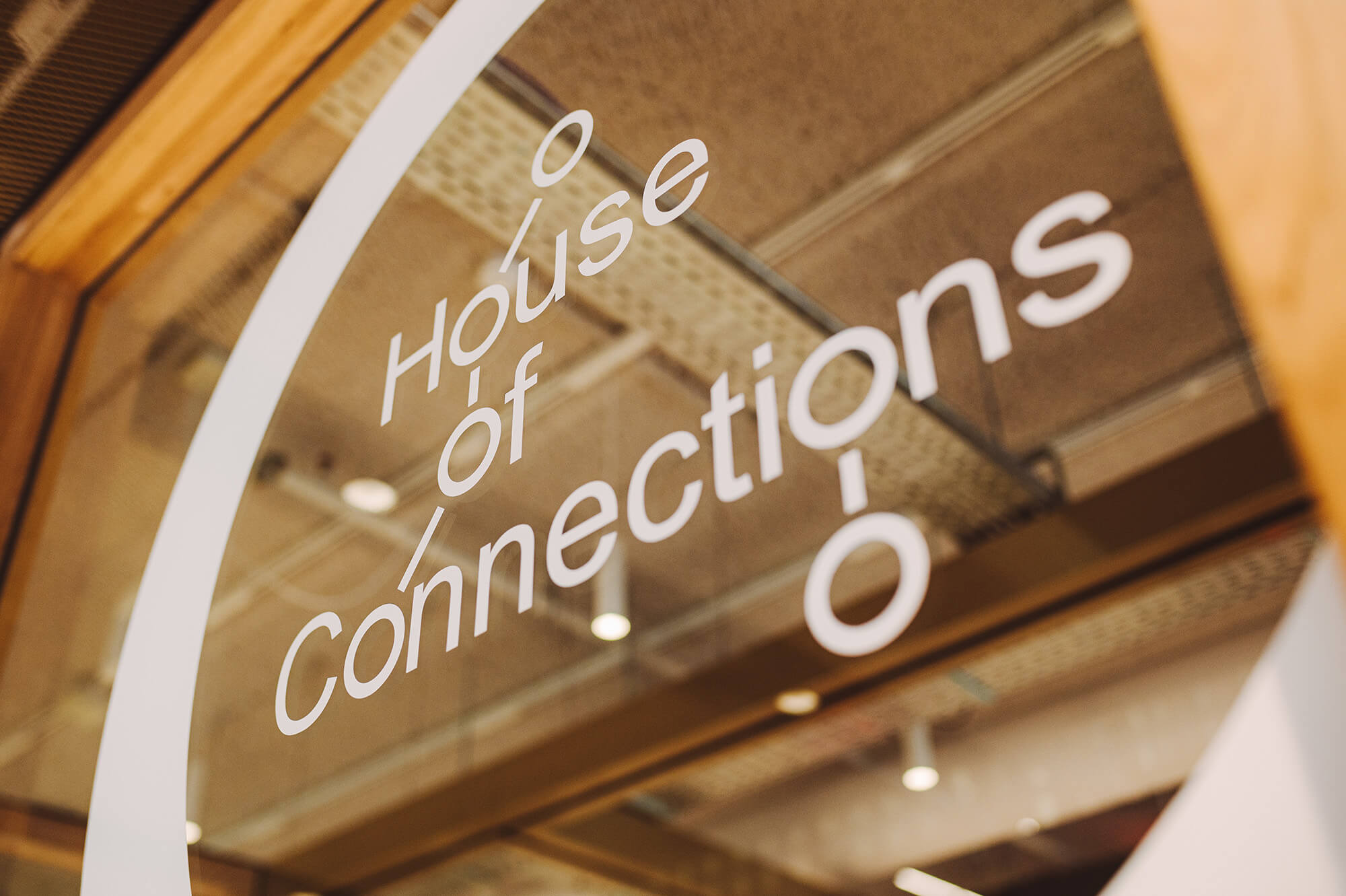
Project identity RUG House of Connections
–We face enormous challenges in the areas of climate change, sustainability, social resilience, more healthy years and digital developments. The RUG sees it as its role and responsibility to contribute to solutions through innovative scientific research and education. The House of Connections is the new home of the University of Groningen on the Grote Markt in Groningen. From the House of Connections, by organizing events and activities, it makes visible how science contributes to solving major social problems.
Buro Reng was asked to design a project style and develop ideas for the official opening and for the public day.
Connecting imagery for Schools for Science and Society
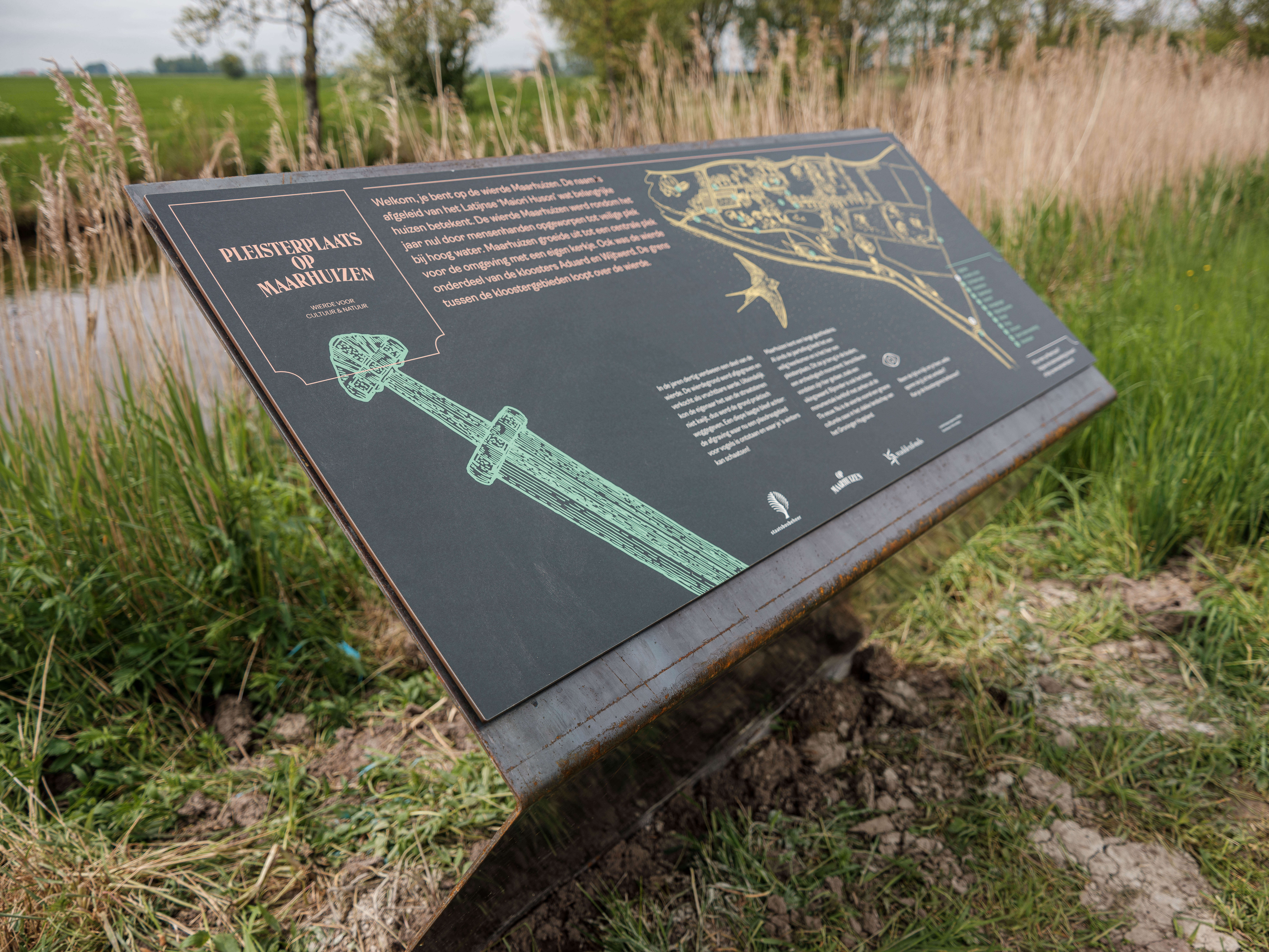
Information about Op Maarhuizen – Parallel to the conversion, renovation and redevelopment as a mound for culture and nature, the visibility of the Op Maarhuizen brand is developing. Step by step according to a preconceived plan. And it’s getting more and more beautiful! This week, three info-signs we designed for Op Maarhuizen and Staatsbosbeheer were installed. Text, editing, images, illustrations, material, execution and location are just a few of the points of attention. Together with Mayke and Gijs, Anje Jager for the illustrations and Ruben Bos, Jan Hoekstra and Bram Verhave of Staatsbosbeheer we made it happen! – anjejager.com
RUG Research Support Portal
–
You want to start a research project and are wondering how to fund it? Or you are wondering during a research project how to publish your results? Just a few questions – as examples – that may be important before, during and after your research. Recently, you can go to the RUG research support portal with such questions. The aim is for researchers to better find their way in search of appropriate support and advice and have more time left for research/teaching. Buro Reng was asked to develop an appropriate style that clearly stands out and underlines the portal’s strategic importance. The inquiring eye in a magnifying glass is the key image of this illustrative branding. Since this week, the portal has been active and you can find a lot of relevant information there as a researcher. – www.rug.nl/research-support-portal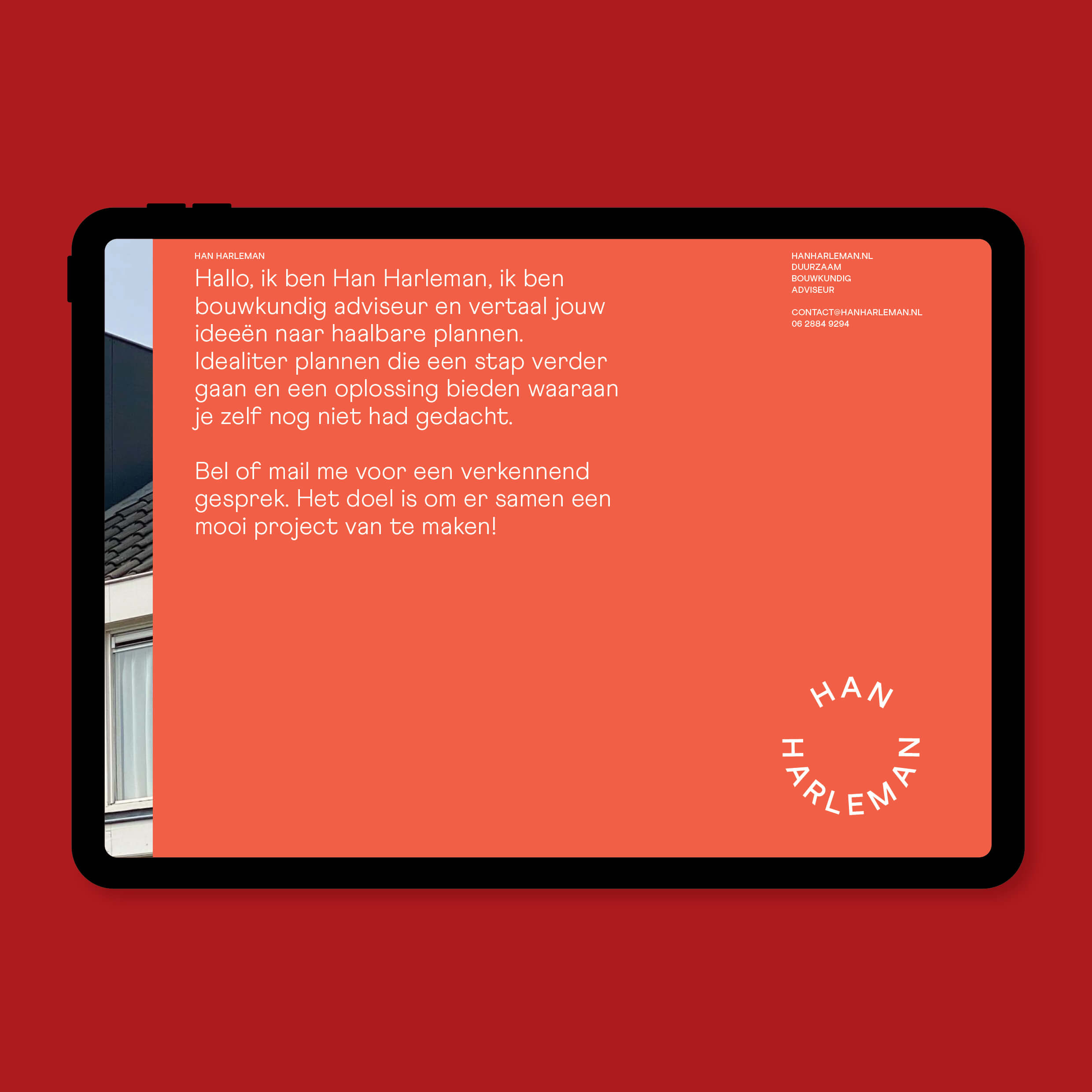
Han Harleman works as a structural engineer and designer. In his one-man practice, the work varies from a small extension to a house to a feasibility study for a project developer. A project is a success if Han realises a permit that seemed impossible, can make a client happy with a surprising plan or floor plan, or knows a suitable contractor who will carry out the renovation of his dreams. Han is the person to turn to with your questions. Han asks us to develop a brand name and brand identity. It will be a logo like a hallmark and a smile; symbolic of Han’s humanity and professionalism.
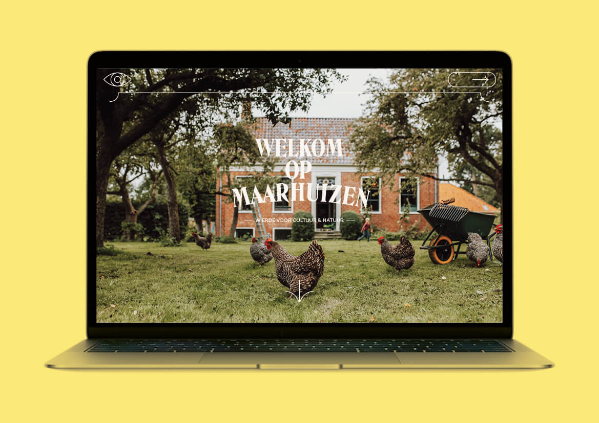
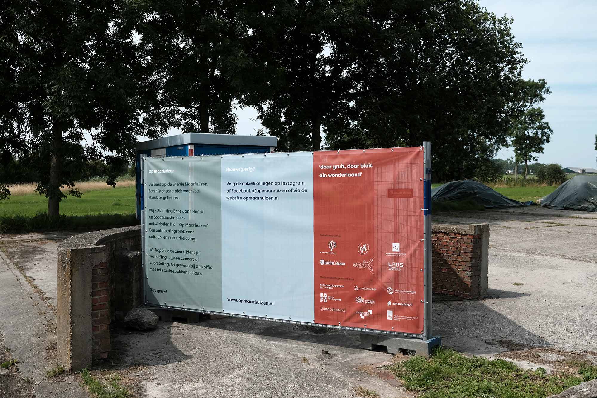
Doar gruit, doar bluit ain wonderlaand – This sentence from the Groningen anthem perfectly typifies the ‘Op Maarhuizen’ project. Still in the making but already well on its way! Mayke and Gijs are starting a new chapter on the mound of Maarhuizen. We were approached by them to design a house style and website. Instead, we first did a joint exploration. The conclusion was that more could be done. And now the new name, style and website are ready. Op Maarhuizen – mound for culture and nature.
–
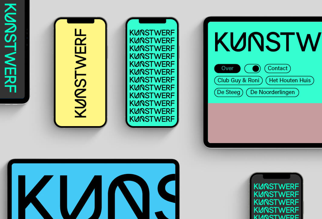
The Kunstwerf on Bloemstraat is the new home of a number of theatre and dance companies. The Kunstwerf houses workshops and rehearsal rooms. The Kunstwerf building was designed by Ard de Vries and Donna van Milligen Bielke. The open inner space around which the practice rooms and workshops are located was designed by garden architect Piet Oudolf. Buro Reng designs the corporate identity and the website. The website is limited in size, offers limited background and content about the place and is mainly a click-through – hub – to the companies housed there. – kunstwerfgroningen.nl
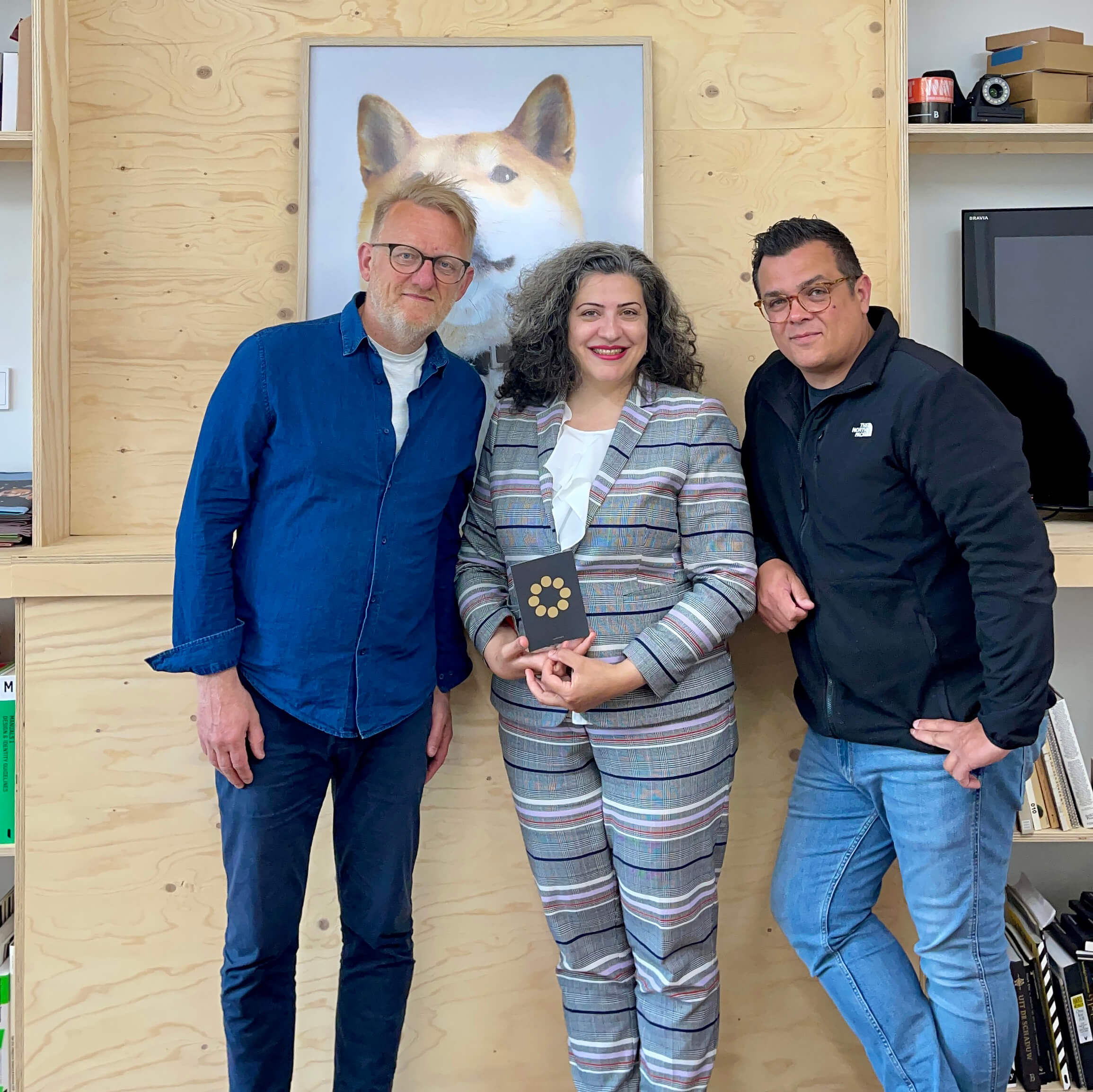
During Covid, we were commissioned to update the brand book for Somaye Dehban – a Dutchified Iranian. Things turned out differently. Or as Somaye put it: I am open to exploring the collaboration opportunity further. How about we start with the visual identity, and then we move to the next phases? We were commissioned to develop a new, personal, visual identity.
We had intensive contact and asked a lot of questions, of course also about her motives and her dreams. We received an unimaginable and very special life story in response. Via email and the screen, because Covid. That changed today. Finally we meet in person. Somaye surprises us with personal gifts, partly selfmade and all with their own beautiful story. We are touched by her warmth and enthusiasm. Keep an eye on this ambitious and charming lady!
Open Agency Night is over and it was very ok. – Our intention was to engage in conversation with the visitors and we succeeded very well. Lots of nice conversations and reactions from and with nice people. About the work, the design process, the alignment of the grid, pizza preferences or job options. It was striking that many visitors knew how to characterise our work and approach perfectly! What also struck me was that many visitors didn’t know us yet…
ACE Terminal – Powering the future with hydrogen! – Gasunie, HES International B.V. and Vopak are working together on the development of an import terminal for green ammonia as a hydrogen carrier. The import terminal for green ammonia makes an important contribution to the market development for green hydrogen and to the climate objectives of 2030 and 2050. To give this collaboration an appropriate identity, we developed a new brand together with the HES, Vopak and Gasunie team: ACE Terminal. Proud to be making a small contribution to this green project.
BURO RENG is participating in Open Agency Night on April 21: ‘The chance to discover the creative industry in the North of the Netherlands’. – On Thursday 21 April, seventeen creative agencies in Groningen and Leeuwarden will open their doors for an evening. They will do this during the first edition of Open Agency Night. OAN is organized for and by northern creatives and demonstrates what the North has to offer in terms of talented agencies. Open Agency Night (OAN) shows who the people behind the northern agencies are, what kind of work they do and what their culture is like. Each bureau presents its own programme, invites speakers and organizes workshops, drinks and other activities. The program takes place from 4 pm to 11 pm. – Go to – www.openagencynight.nl to view the program and book tickets.
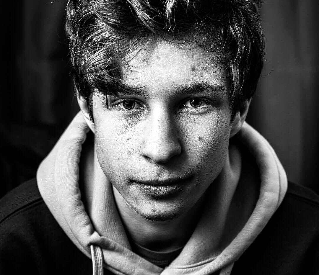
Trainee Tigo
– Tigo is studying AV specialist at the Noorderpoort and recently started an internship with us.Tigo is mainly interested in making commercials, branding, advertising, that sort of thing. We introduce him to our way of working and the fact that it is smart to start at the beginning. Photo – Emily Wortel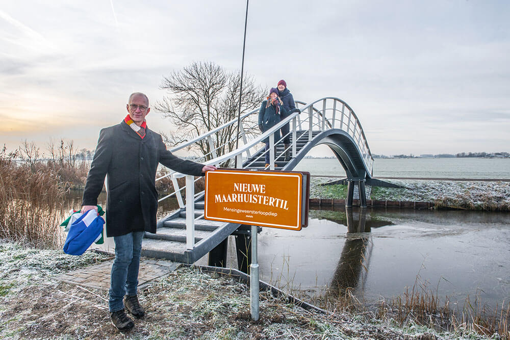
It could hardly be more symbolic: realisation ‘Op Maarhuizen’ starts with the construction and unveiling of a new bridge.
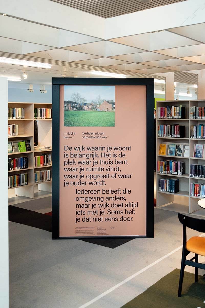
– Last year, alderman de Vries of the Hogeland municipality unveiled the name of the new bridge – or ’til’. The bridge connects Maarhuizen with Mensingeweer and Winsum and makes the mound easily accessible for tourists, including Pieterpad walkers. It was also the starting signal for the construction activities of Enne Jans Heerd and the unveiling of one of the first visible results of the assignment we are carrying out for Mayke and Gijs: the branding of ‘Op Maarhuizen’. Photo – Egbert ReuserThe neighbourhood you live in is important!
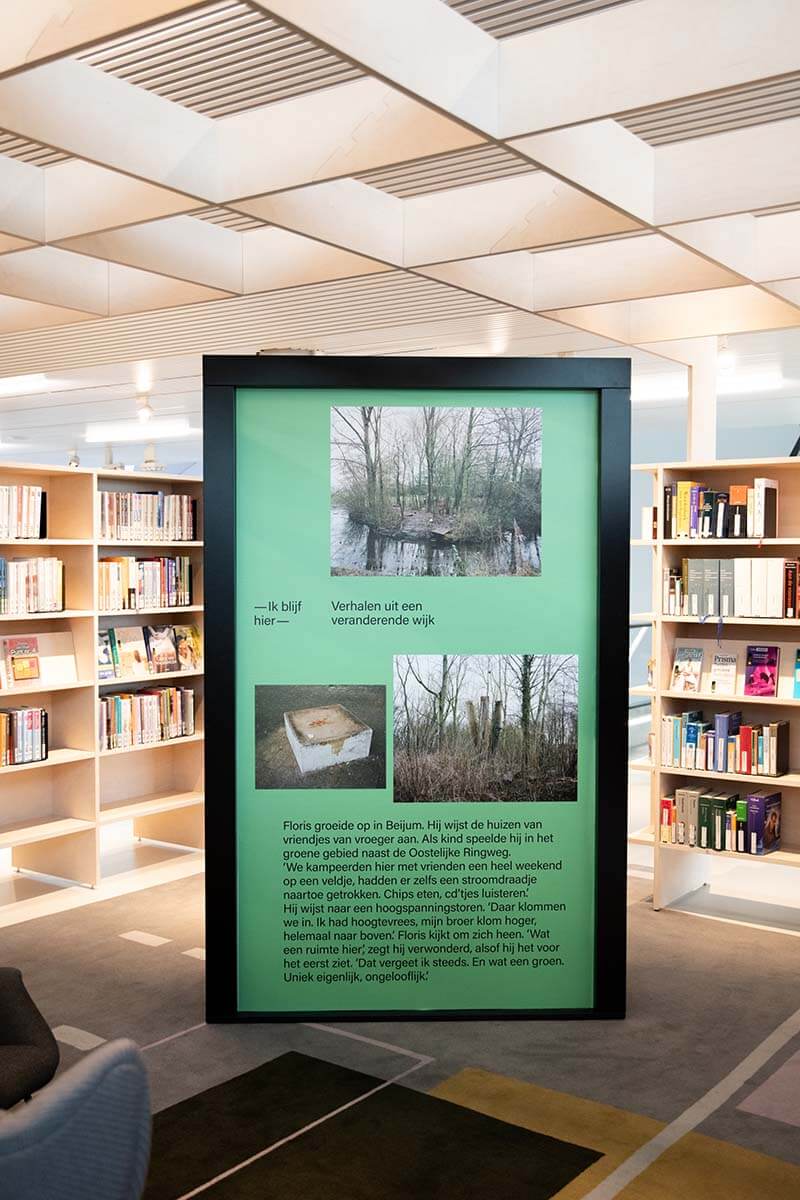
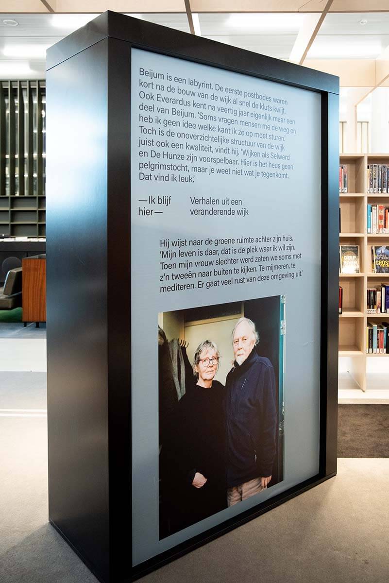
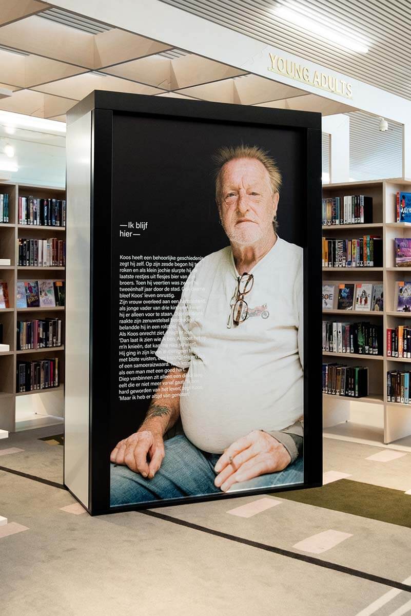
<p class="p1">-</p> Small expo on neighbourhood renewal and the – Ik blijf hier – project during and after the Let’s Gro festival in Forum groningen. ‘Ik blijf hier’ is a meeting with the neighbourhood and gives the floor to inhabitants of the neighbourhood. A collaboration with Tussenland, David Vroom, Sijas de Groot, Chris Zwart, Groningen municipality and Buro Reng. Pictures expo – David Vroom.
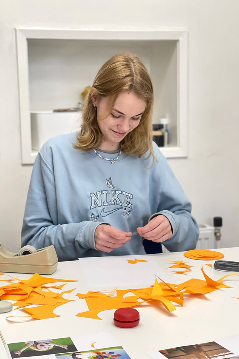
Internship
<p class="p1">-</p> Senna – 15 years old and a high school student – is joining us this week to get a feel for the profession and the practice. We go from an introductory meeting to a presentation to designing a personal logo in one week. Well done Senna!
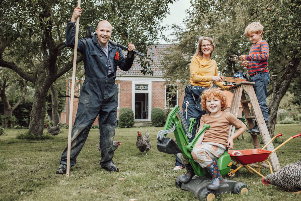
Crowdfunding campaign for ancient mound
–
Just above Winsum lies the age-old mound ‘Op Maarhuizen’. Once a safe haven during high tide. Nowadays, it is a wonderful platform for nature and culture. A place that has been developing for centuries. Mayke and Gijs are adding a new chapter to it. And they are really almost there… almost, but not quite. That is why they have started a crowdfunding campaign. Take part in the crowdfunding and give ‘Op Maarhuizen’ the final push to get started! We have until 1 November to raise € 50,000. Every contribution is welcome, no matter how large or small. So go quickly to the crowdfunding campaign via Voordekunst.To the crowdfunding
From hangover to takeover
–
FSG stands for Financial Study Organisation Groningen. FSG wants to bridge the distance between study and professional practice and originated from the merger of study associations R!SK and PM. A long time ago, we were commissioned to take care of the rebranding for R!SK. And now for FSG. Special about the assignment for R!SK and FSG is that the students will carry out the style themselves. The corporate identity manual that we developed as part of the assignment is their guide.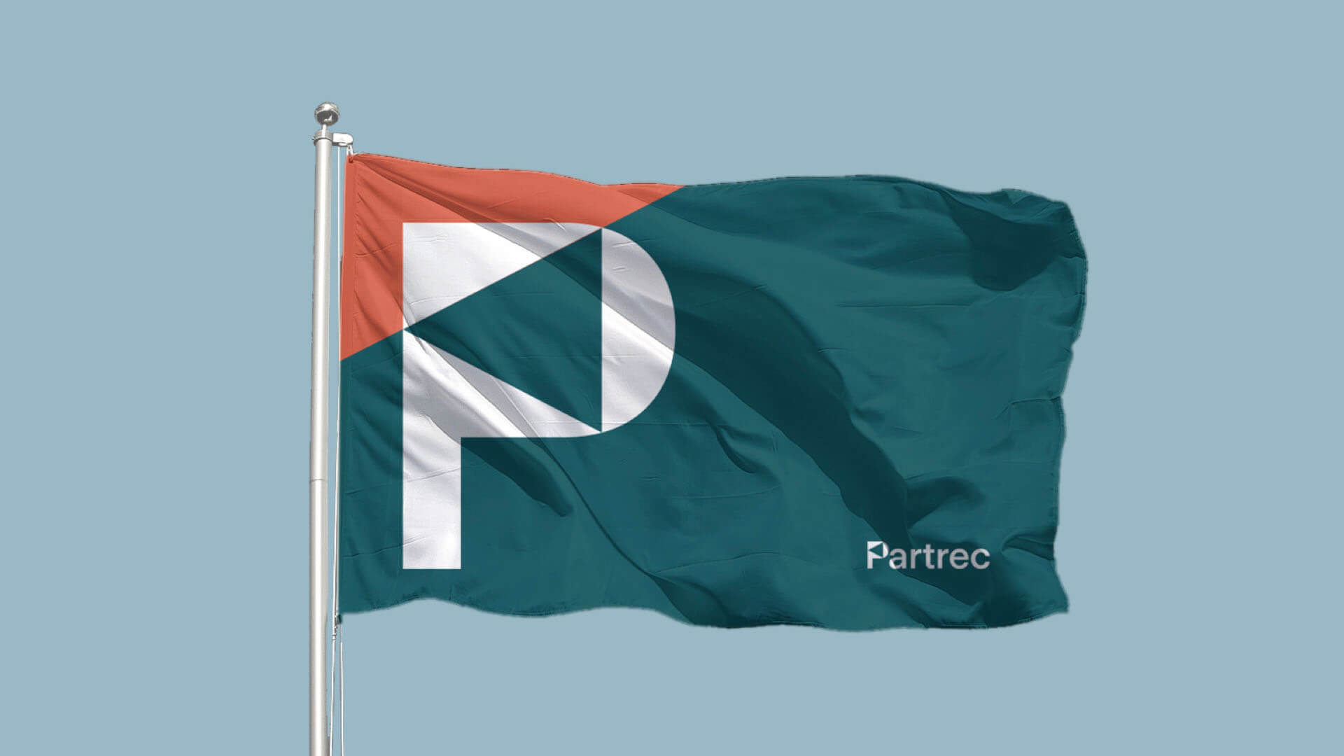
Branding for Particle Therapy Research Center
–
PARTREC is a dedicated research facility functioning in synergy with the UMCG Groningen Proton Therapy Center (GPTC). PARTREC combines technological development, preclinical and patient studies with an R&D program to continuously improve proton therapy technology and the treatment itself. PARTREC is the successor of KVI-CART that closed its doors as an institute of the University of Groningen (RUG) in September 2020. Buro Reng developed the brand identity and is co-developer of the new brand name.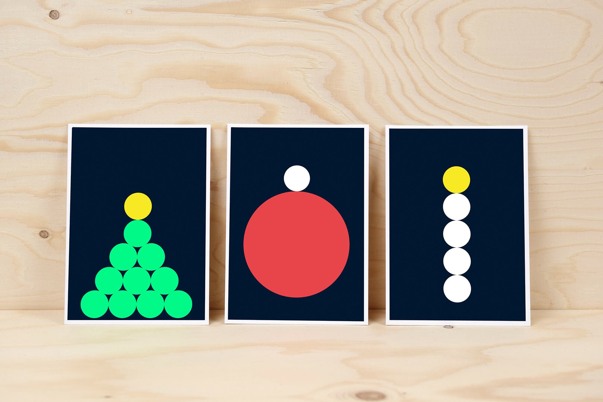
Name and corporate identity for startup
–
Annelies and Martijn started a company. Their goal: to bring work and personnel in healthcare together – but in a personal way. With the help of merkKompas the communication question becomes clearer. We develop the positioning, brand strategy, name, corporate identity and branding.Go to the case
A wierde in motion
–
Working to bring attention to a special place. After Hotel de Marne and Wongema – see the cases – we’re now working on the wierde of Maarhuizen. A lot is going to happen on the wierde of Maarhuizen – near Winsum. To give you a first idea, we have developed a construction banner with information about the coming changes. This historical site will remain a place for cultural and natural experiences, and beautiful things are going to take place there. And Buro Reng likes to think along about design and communication. –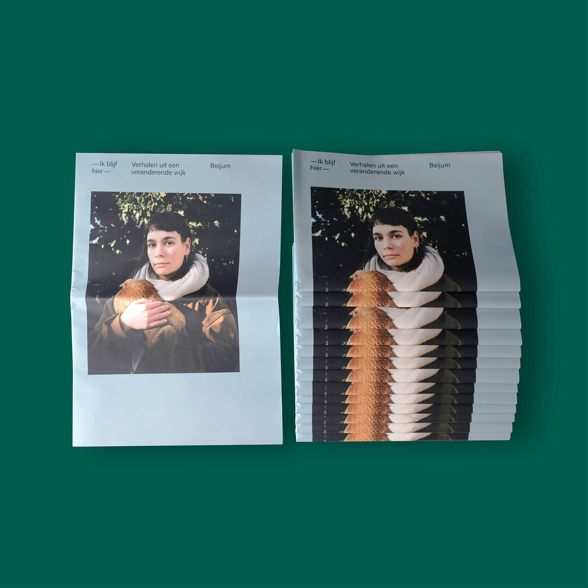
Ik blijf hier
–
Four residential areas in Groningen are getting a facelift. They have to become better, nicer places. But what is it really like to live in these neighbourhoods? Theatre maker Sijas de Groot and photographer David Vroom will spend a year looking for the story of these neighbourhoods. Sijas and David, together with text writer Chris Zwart, will write the big story of each of these neighbourhoods on the basis of all the stories they collected. The story of each neighbourhood will end up in a newspaper that we will give back to the neighbourhood residents. In this way, we try to get you to look at your own neighbourhood in a different way. Because often the special is in the everyday – you just have to see it.– Ik blijf hier – is an initiative of Foundation Tussenland, commissioned by the municipality of Groningen and carried out within the framework of neighbourhood renewal in Beijum, Selwerd, De Hoogte/Indische Buurt and De Wijert.
Interviews and research — Sijas de Groot
Photography — David Vroom
Text — Chris Zwart
Project leader— Marieke Hollemans
Business manager Tussenland — Juul Huitema
Design and advice — Buro Reng
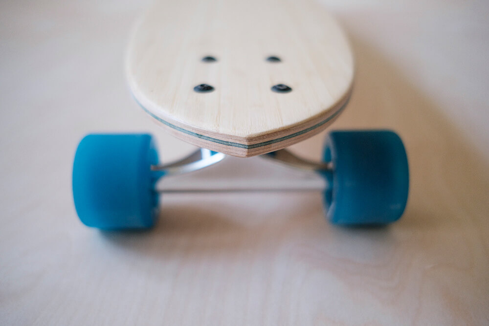
Buro Reng developed the brand name, identity, website and webshop for Bosmade. Bosmade is Tjeerd Bosma. We know Tjeerd mainly as a web developer. But Tjeerd is a multi-talent. He designs, develops and manufactures skateboards in his workshop in Haren, Groningen. These are handmade minicruisers, cruisers, pintails and longboards. Unique boards are made with a lot of attention, love and an eye for detail. Every board is different, a variation or development of the previous one. Soon to be available in the webshop.
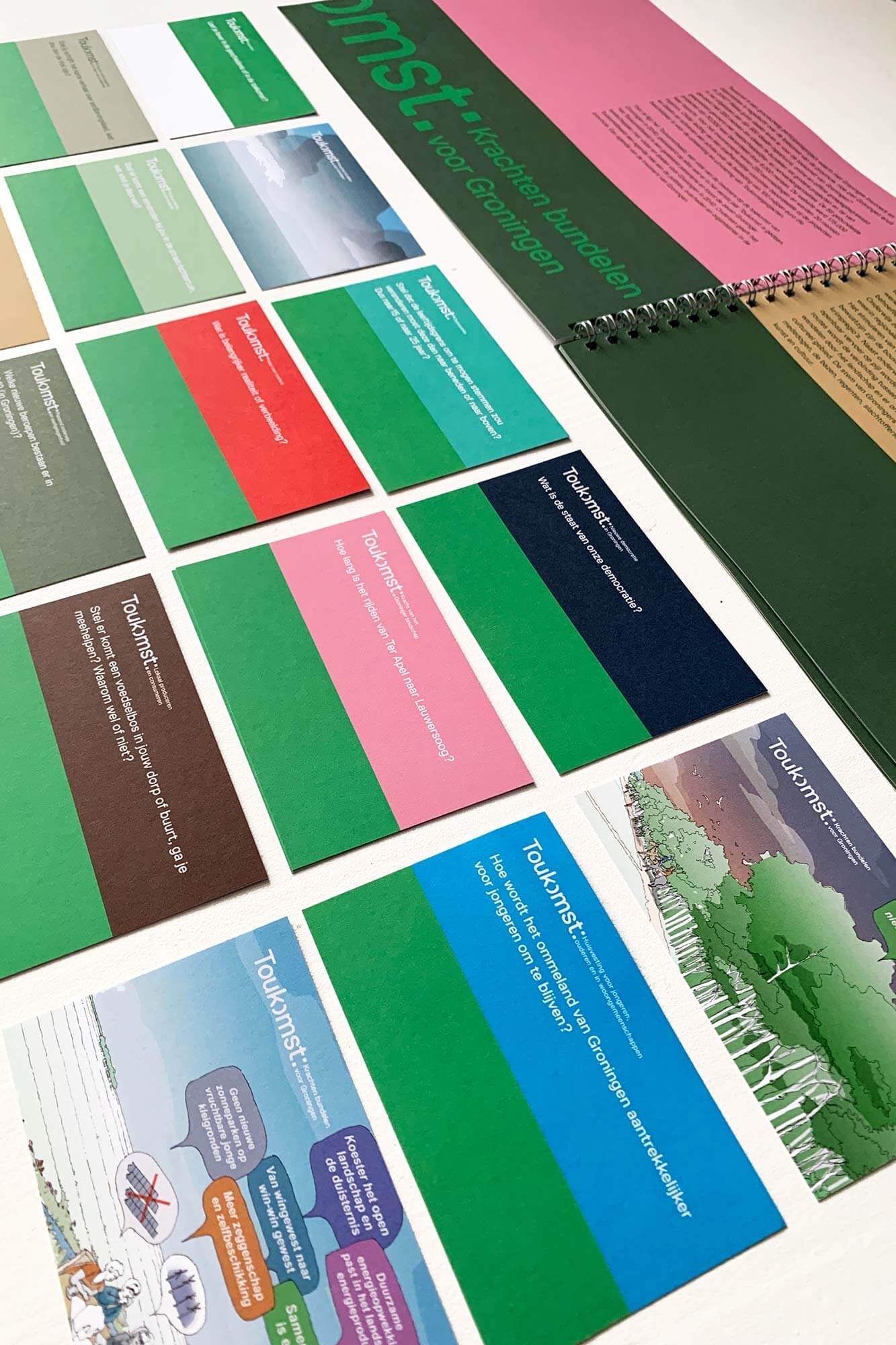
Toukomstbeeld
–
Toukomst is an initiative of Nationaal Programma Groningen together with West 8 (design bureau for urban development and landscape architecture) and organisations from the province of Groningen. Toukomst is building projects for the future of Groningen. 100 million euros is available for the implementation of these projects. The ideas that Toukomst collects are the basis for the Toukomst projects and the Toukomst image. Toukomstbeeld is a publication with examples and a selection of projects that have been shaped by the inhabitants of Groningen. A drawn panorama with seven landscapes of Groningen with visions and goals for Groningen in 2040, written and drawn by West 8 and co-developed by Gebied-B. Toukomstbeeld – the brochure and the questions with maps – is an invitation to give shape to the future of Groningen together – residents of Groningen, politicians, authorities and organisations in the province.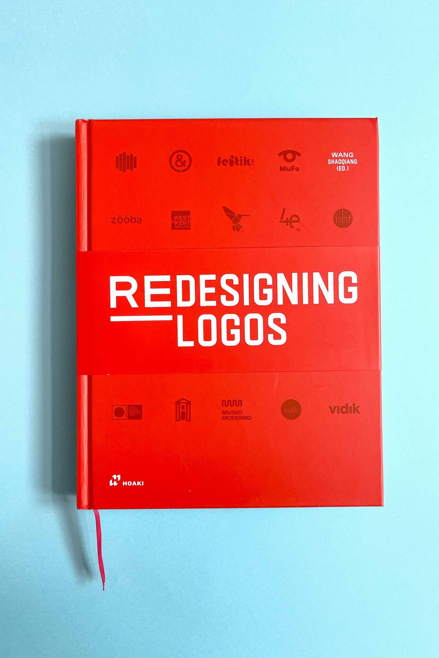
We’re in it
–
‘Redesigning Logos is a spectacular compilation featuring the best examples of redesigning logos. It features almost 400 outstanding redesigned logos worldwide to reveal how logos are created and evolve. This book presents some of the best examples of logo redesigns and provides valuable information on how designers have arrived at that solution.’ We’re in it with 4 projects!
My name is Julia
–
I am a 3rd year Graphic Design student at Minerva Academy in Groningen. Meanwhile, I have an internship at BURO RENG for about a month. I learn a lot here, because I can follow the entire (design) process. From the question of a graphic or communicative solution to a suitable design. In addition, perhaps the most important aspect of a good internship, a cozy and professional team where I have already learned a lot and may learn even more.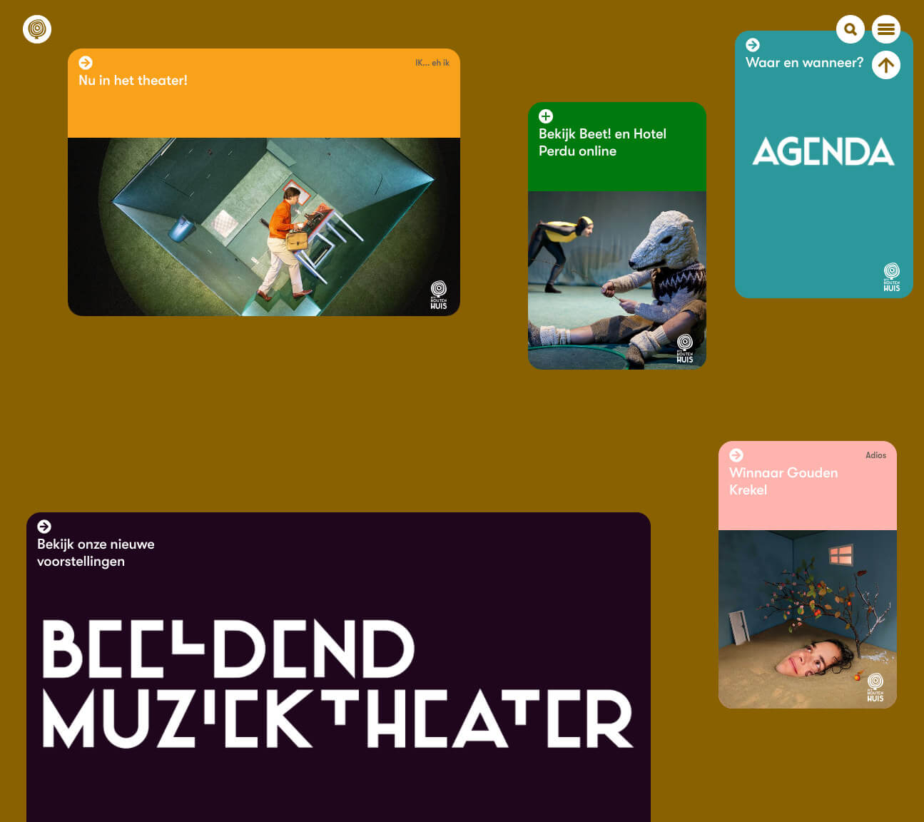
A new website for Het Houten Huis
–
Het Houten Huis is the visual music theatre company of the North.
What started with the request for a new website led to a collaboration lasting many years. In order to create a suitable website, we got to know each other better. Conversations, consultations, presentations and performances. Wonderful performances in which image, story, music take you to that very special Wooden House world. And we became fans! Not only of the performances, also of the educational projects; Het Houten Huis in the Classroom.
We took a close look at a lot of things. What does Het Houten Huis want, why does it revolve and how can we portray it? We developed the house style, the visual concept for the performances, the art direction, the photography, the logo, the typography – an own font. And now – finally – the website. The challenge was to design a good platform for all those beautiful images, videos and the world of Het Houten Huis. A beautiful task!
hethoutenhuis.org
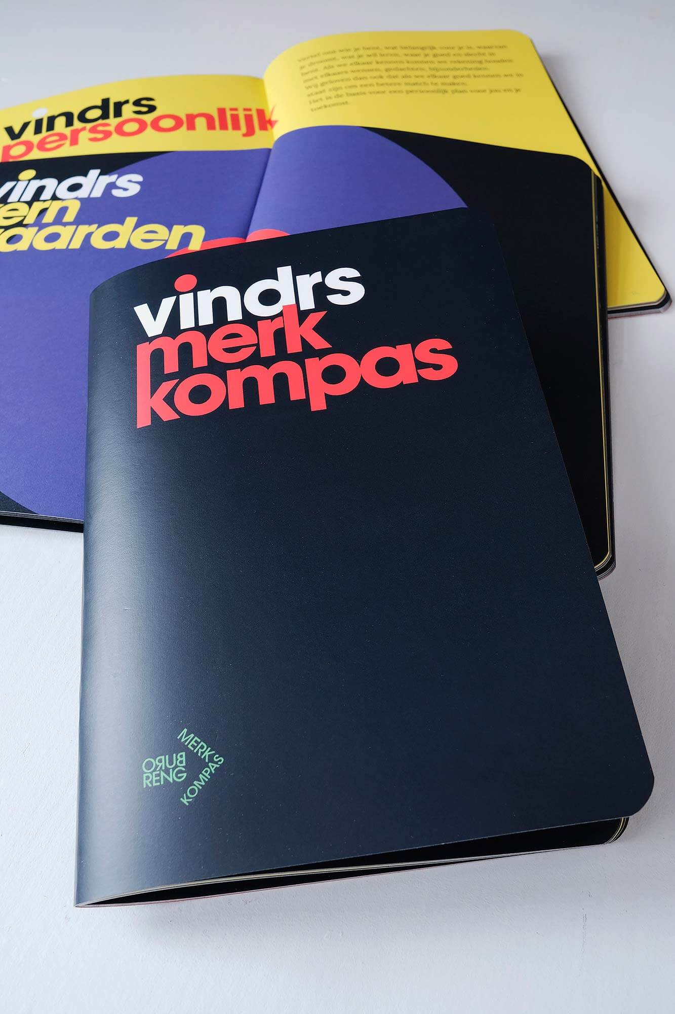
Risk management according to Buro Reng
–
You invest in a new name and face for your company. Then you also want it to be clear to everyone involved what you stand for and how you propagate it. The Brand Compass then literally becomes a guiding tool and a handle for a consistent brand policy. History, strategy, core values, communication, image, word and corporate identity are described in it. The result of a very nice process and the basis for the new Vindrs brand.

New name, logo and visual identity for Gasunie Engineering
–
Gasunie Engineering – sister company of national gas network operator Gasunie Transport Services (GTS) – has changed its name and logo. This change creates a clear distinction between the commercial companies within the Gasunie group and the gas network operator that carries out statutory tasks. The aim is to create equal opportunities for companies to develop new energy services. Important in view of the current energy transition.
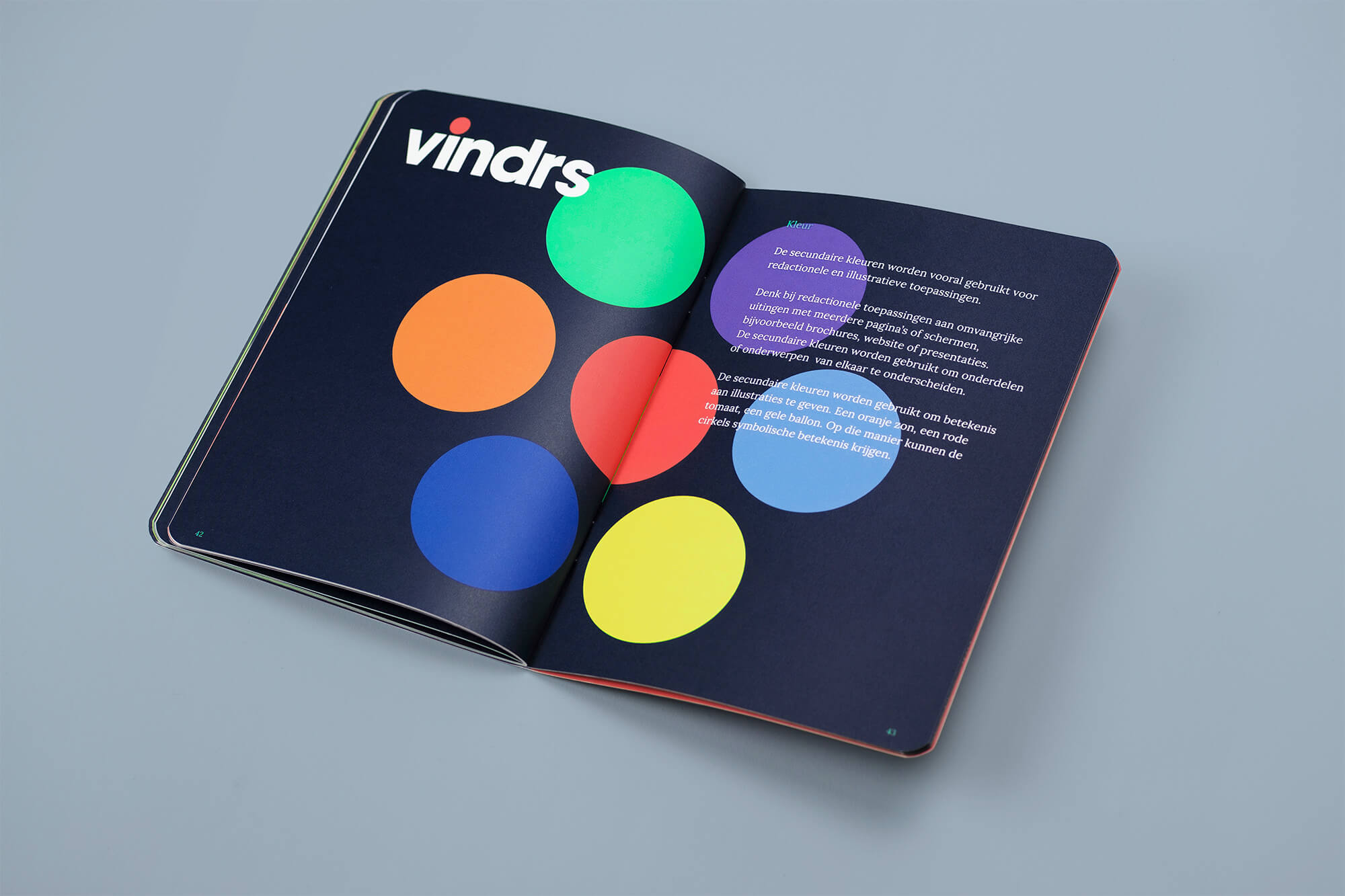
A good example of the Buro Reng approach. The question for a new corporate identity leads to a repositioning. The use of merkkompas provides insight into new opportunities and challenges that are better suited to the new ambitions. With this new strategy, brand name and visual identity, Vindrs is ready for the future!
Vindrs.nl
Good news for grandpa or grandma! What do you do when you can’t go to grandma or grandpa because of corona? Make a newspaper! A special newspaper for your grandparents. Full of fun and short messages about what’s on your mind. You mail the text and photos and Krantje Speciaal does the rest.
Make your own Krantje Speciaal
Good news!
–
Our posterdesigns are featured on www.typographicposters.com Typo/graphic posters is a platform for inspiration and promotion of good design through the poster culture. It focus exclusively on typographical and graphical posters, those that challenge type, colors and shapes to express a message.
Bekijk het hier
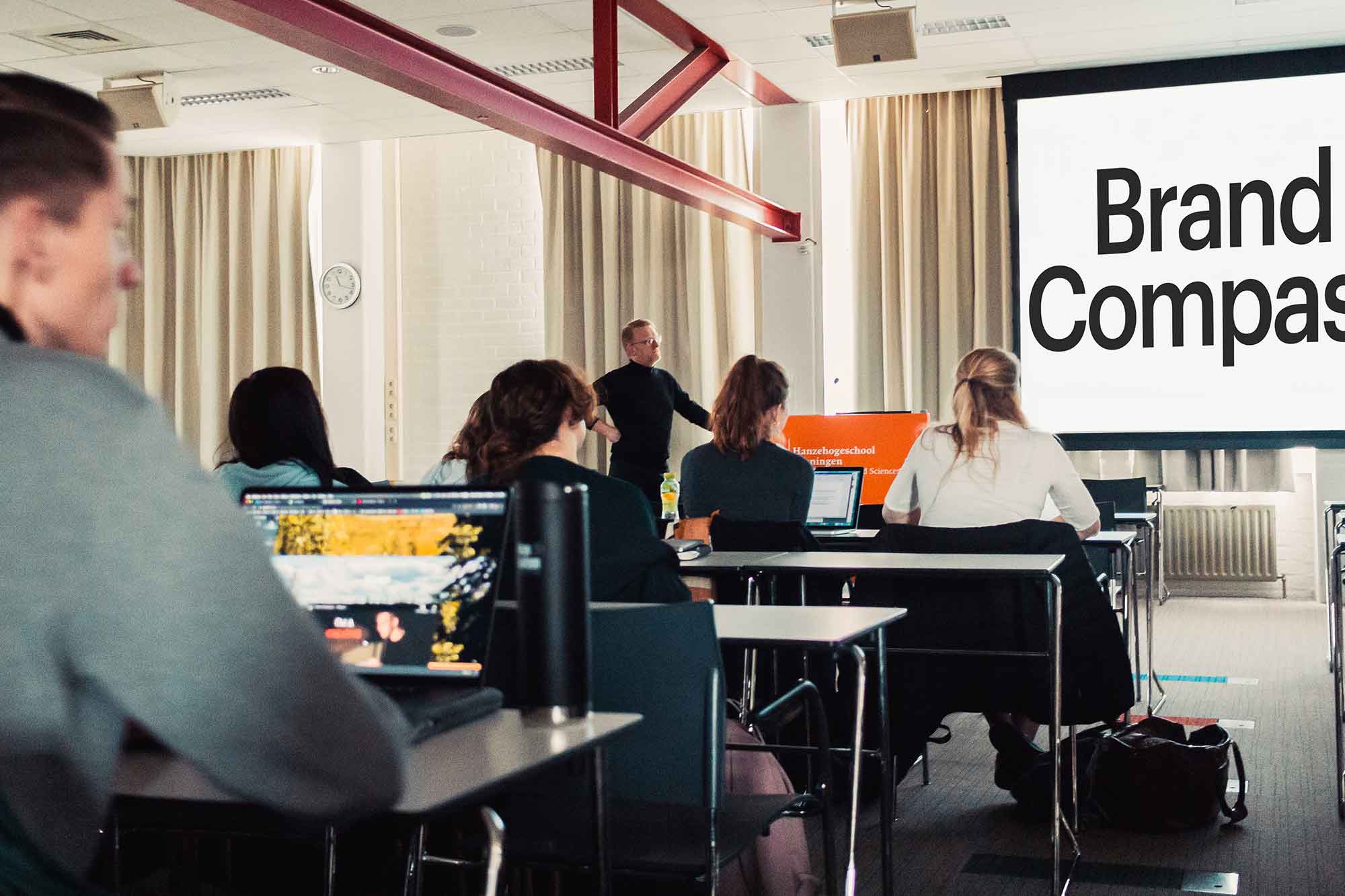
An inspirational start of the day
–
This morning the gentlemen from Buro Reng gave an awesome lecture about their company, the way they work and they showed a lot of good looking case studies! It sure was an inspirational start of the day.
Nice reaction from the study association for all communication, media & IT studies and the students of the Institute for Communication, Media and IT of the HanzeHogeschool.
An excellent opportunity to introduce the Buro Reng MerkKompas to these future colleagues. The enthusiastic reactions showed that people understand the advantages of this working method!
Maybe you’ve also become curious about our methods and story? Let us know, we’ll be happy to tell you about it.
<span style="color: #787878;"><a style="color: #787878;" href="https://www.buroreng.nl/merkkompas/">More about Buro Reng MerkKompas </a></span>
Featured
–
Buro Reng’s Mister Type project is featured on weandthecolor.com. WE AND THE COLOR is a web magazine for your daily art and design inspiration. We feature outstanding projects of various creative fields.
Check it here
The appearance of the Groningen landscape and the spatial planning in Groningen’s villages and cities is at stake.
–
Buro Reng designs the corporate identity and website for De Toeverlaat. A collective of Groninger architects who believe that advice and help to residents of the Groningen earthquake area can and should be improved. A good collective and a goal that we wholeheartedly support. br] Participating architects: Rob Hendriks, Paul van Bussel, Tjalling Zondag, Allart Vogelzang, Beatrice Montesano, Wim Barneveld, Erik Roerdink, Annet Ritsema, Sjoerd Tasseron, Arnold Venema and Geir Eide.
www.detoeverlaat.nl
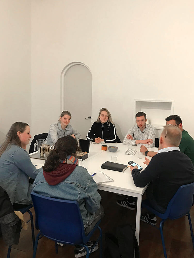
Students visiting
–
In conversation with students Media and Design of ROC Friese Poort about innovation and design. What do you think the meaning of innovation is? And do you also innovate? Good conversations and enthusiastic stories. Fun and meaningful.
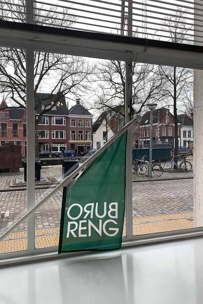
New address
–
After years of working with great pleasure at the Munnekeholm, we have chosen a new workplace. We have moved to another beautiful location in the center of Groningen. At this new location we are more visible and accessible. Curious? Come for a coffee!
Buro Reng
Hoge der A 31
9712 AE Groningen
Typeface Design – Het houten Huis
–
This is the teaser film for the latest performance – Ruimtevlucht – by Het Houten Huis and Holland Opera. Ruimtevlucht is a performance about the ‘stowaway’ you carry with you. The result is a universe of visual theatre with absurd humour, enchanting vocals and live music, directed by Elien van den Hoek. The title ‘Ruimtevlucht’ is written in the new, tailor-made font. It is part of the new visual identity and brand strategy that Buro Reng is developing for Het Houten Huis. Teaser by: Boris Stokman, Mo Visser, Zoscha van Erkel, Elien van den Hoek. Music: Marting Franke, Niek Idelenburg.
More about the show
Branding – Lode, The New Excalibur Sport
–Lode BV is a specialist in medical ergometry. We developed the exhibition design and digital marketing for The New Excalibur Sport, the ultimate bicycle ergometer. It is one of the most important product brands for Lode BV. With the help of our MerkKompas we designed the brand strategy and the multimedia campaign. Resulting in the European brand campaign kick-off in Prague of this top ergometer; SMARTER, BETTER, STRONGER!
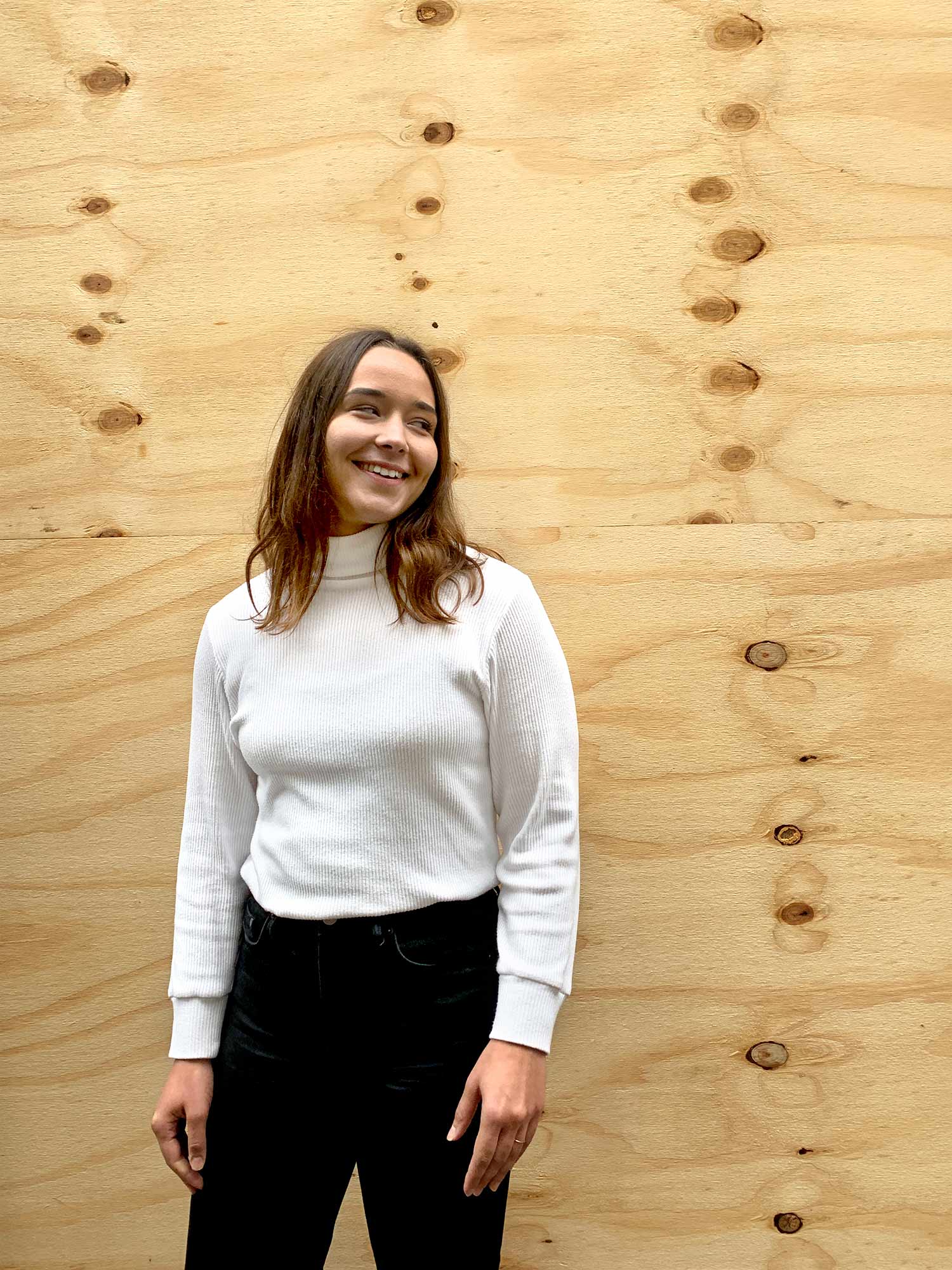
Hi this is Linde!
–I’m studying Graphic Design at ArtEZ Zwolle and I’ve been doing an internship at Buro Reng for a month now. I was looking for an internship in which graphic design and research are linked and where the process is just as important as the thesis. In Buro Reng this place has been found! Great team, good atmosphere, interesting vision and instructive conversations.
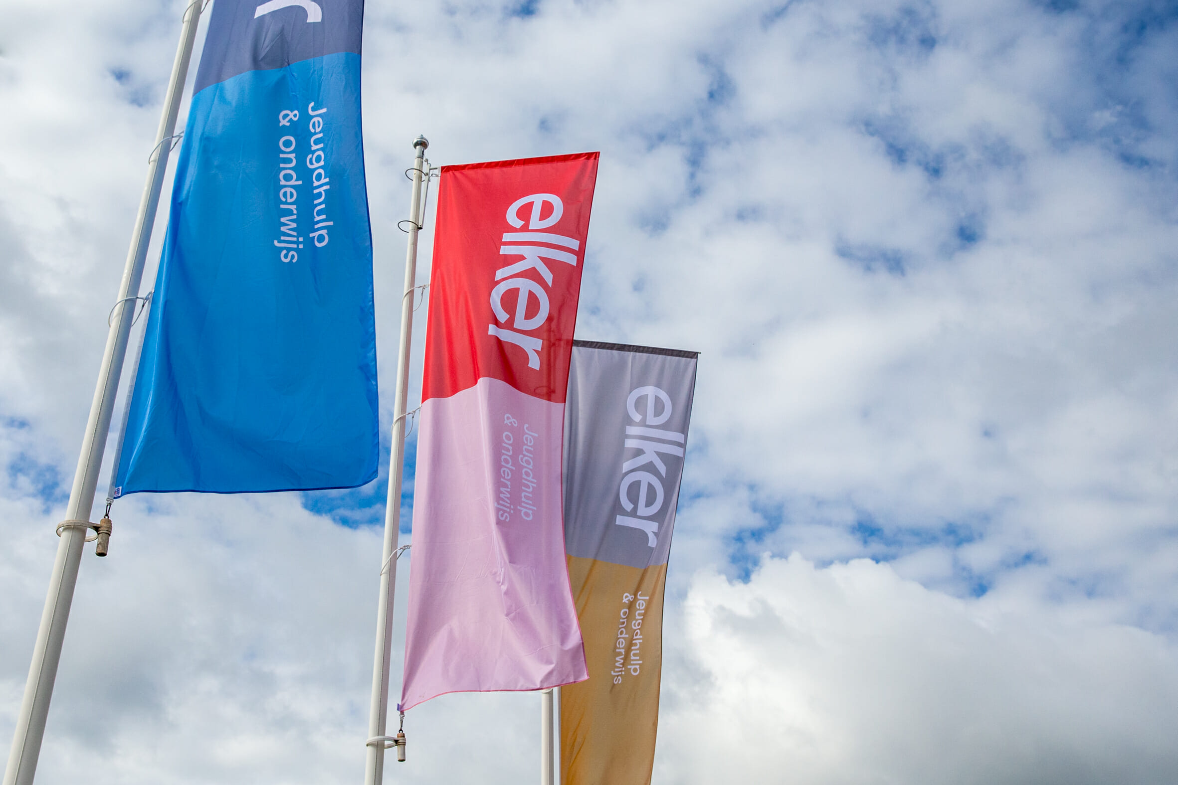
New visual identity for youth care organization ELKER
–Buro Reng designs the new logo and the new corporate identity for ELKER. We hope that the dedication and involvement of Buro Reng contributes to the objectives of Elker and thus to help young people!
View project Elker
Animations for social media campaign R!SK
–For Risk – the Financial Study Association of the University of Groningen – Buro Reng designs animations for Instagram stories, as part of the digital branding strategy.
View project R!SK
